So, you’ve got a fresh new coloring book and you can’t wait to bring those black and white pages to life with vibrant colors. But hold on, coloring can be more than just filling in the lines. In this article, we will explore some helpful tips and techniques to enhance your coloring experience and create stunning works of art. From choosing the right materials to blending colors like a pro, get ready to unleash your creativity and learn all the secrets of how to color coloring pages.
Choosing the Right Tools
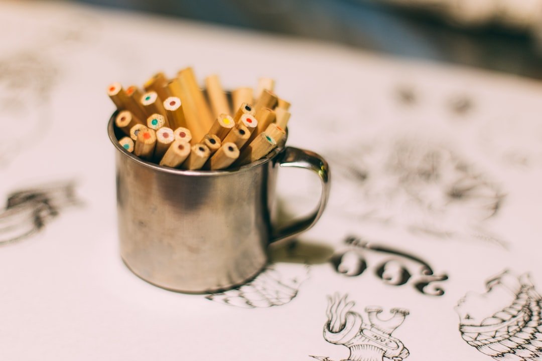
When it comes to coloring, choosing the right tools is essential to achieve the desired results. The first step in selecting the right coloring medium is to consider your personal preferences. Are you someone who enjoys the convenience of digital coloring, or do you prefer the tactile experience of coloring with traditional materials? Once you’ve determined your preferred medium, whether it’s colored pencils, markers, or watercolors, it’s important to choose quality tools that will allow you to color with ease and precision.
Selecting the Right Coloring Medium
Choosing the right coloring medium depends on your personal preferences and the desired outcome of your coloring page. Colored pencils are a popular choice as they offer control and precision, making it easy to achieve intricate details. They are also portable and can be easily blended for beautiful gradients. If you prefer vibrant, bold colors, markers may be the best option for you. Watercolors, on the other hand, are great for creating soft, translucent effects and can be used for both delicate washes and vibrant paintings.
Choosing Quality Coloring Tools

Investing in quality coloring tools can make a significant difference in your coloring experience. When selecting colored pencils, look for ones that have a strong pigment and a smooth, even texture. This will allow for easy blending and layering of colors. For markers, choose ones with a fine, durable tip that won’t fray easily. Make sure the markers have vibrant, fade-resistant ink for long-lasting artwork. When using watercolors, opt for high-quality paints that offer a wide range of colors and have good transparency and lightfastness.

Exploring Different Coloring Techniques
Once you have chosen your coloring medium and gathered your coloring tools, it’s time to explore different coloring techniques. Experimenting with various techniques can add depth and interest to your 색 페이지. Some popular coloring techniques include shading, blending, and adding texture. Shading involves creating different values of a color to give the illusion of depth and form. Blending is the process of smoothly transitioning colors to create a seamless gradient effect. Adding texture can be done by using techniques like stippling or cross-hatching to create interesting patterns and effects on your coloring page.
Preparing the Coloring Pages
Before you dive into coloring, it’s important to properly prepare your 색 페이지 to ensure the best results. This includes choosing the right paper, printing or purchasing 색 페이지, preparing the coloring surface, and using tracing paper when needed.
Choosing the Right Paper
Choosing the right paper for your 색 페이지 can make a significant difference in the quality of your artwork. Opt for paper that is thick and durable, preferably with a smooth surface that allows for smooth coloring and prevents bleeding of colors. Look for paper that is specifically made for coloring, such as sketchbook paper or drawing paper. Avoid using regular printer paper, as it is often too thin and prone to tearing or warping when exposed to wet coloring media.


Printing or Purchasing Coloring Pages
There are a variety of options when it comes to 색 페이지. You can either print them at home using websites or software that offer free or paid coloring page downloads. Alternatively, you can purchase 색칠 공부 책 or individual coloring pages from bookstores or online retailers. Consider the level of intricacy and the style of the 색 페이지 you prefer. Some websites offer printable coloring pages for different skill levels, from simple designs for beginners to intricate patterns for advanced colorists.
Preparing the Coloring Surface
Before you start coloring, it’s important to prepare the coloring surface to ensure smooth and even coloring. Place a sheet of scrap paper or a protective mat underneath your coloring page to prevent color transfer and to keep your work surface clean. If you are using colored pencils, you can use a kneaded eraser or a soft cloth to lightly brush off any loose graphite or pencil marks on the page. This will help prevent smudging and ensure that your colors appear vibrant and true to their intended hue.

Using Tracing Paper
Tracing paper can be a helpful tool when coloring complex or detailed designs. If you are unsure about where to place your colors or if you want to try out different color combinations, you can use tracing paper to create a preliminary sketch or color overlay. Simply trace the outlines of the design onto a separate sheet of tracing paper and experiment with different color schemes. Once you are satisfied with your choices, you can transfer the colors onto the final coloring page by tracing over the outlines with a pencil or a light box.
Understanding Basic Color Theory

Having a basic understanding of color theory can greatly enhance your coloring skills and help you create visually appealing artwork. Color theory is the study of how colors interact with each other and how they can be used to create different visual effects.
Primary, Secondary, and Tertiary Colors
In the world of color theory, primary colors are considered the building blocks of all other colors. These colors cannot be created by mixing other colors together and include red, blue, and yellow. Secondary colors are created by mixing two primary colors, resulting in green, orange, and purple. Tertiary colors are created by mixing a primary color with a secondary color, such as red-orange or blue-green. Understanding these color relationships can help you choose colors that work well together and create harmony in your artwork.
Color Harmonies and Combinations
Color harmonies refer to combinations of colors that are visually appealing when used together. Some common color harmonies include complementary colors, split complementary colors, analogous colors, and monochromatic colors. Complementary colors are opposite each other on the color wheel, such as red and green or blue and orange. Split complementary colors involve using one color and the two colors adjacent to its complementary color. Analogous colors are next to each other on the color wheel, such as yellow, yellow-green, and green. Monochromatic colors involve using different shades and tints of a single color. Experimenting with these color harmonies can add visual interest and balance to your coloring pages.
Understanding Warm and Cool Colors
Warm and cool colors have different visual effects and can evoke different emotions. Warm colors, such as red, orange, and yellow, tend to be associated with energy, warmth, and excitement. They can create a sense of vibrancy and can be used to draw attention to specific areas of your artwork. Cool colors, such as blue, green, and purple, are often associated with calmness, tranquility, and depth. They can create a soothing atmosphere and can be used to create a sense of depth and distance in your coloring pages. Understanding the emotional impact of warm and cool colors can help you effectively convey the mood or atmosphere you want to achieve in your artwork.
Exploring Different Coloring Styles
Coloring allows for personal expression and creativity, and there are various styles you can explore to make your coloring pages unique. From realistic coloring to minimalist coloring, each style offers its own distinct characteristics and creative opportunities.
Realistic Coloring

Realistic coloring aims to recreate the colors and textures found in the real world. It involves careful observation and attention to detail to accurately represent objects, people, or scenery. This style often requires layering and blending of colors to achieve realistic shading and depth. Realistic coloring can be a rewarding and challenging style to explore, especially for those who enjoy capturing the intricate details of their subject matter.
Cartoonish Coloring
Cartoonish coloring takes a more playful approach by exaggerating features and using bold colors to create a whimsical and lively look. This style is often associated with comic books, animated films, and children’s illustrations. Cartoonish coloring allows for creative freedom, encouraging colorists to experiment with vibrant hues and imaginative interpretations. It’s an excellent choice for those who want to add a sense of fun and lightheartedness to their coloring pages.
Stylized Coloring
Stylized coloring involves applying a unique personal style to your coloring pages. It allows you to explore different techniques, combine various color schemes, and experiment with unconventional color choices. Stylized coloring can involve abstract patterns, intricate designs, or bold brush strokes. This style is all about embracing creativity and expressing your individuality through your artwork.
Minimalist Coloring
On the other end of the spectrum, minimalist coloring focuses on simplicity and the art of restraint. It involves using a limited color palette and minimal details to create a clean and uncluttered look. Minimalist coloring can be achieved through the use of negative space, simple lines, and subtle shading. This style is perfect for those who prefer a more refined and understated approach to coloring.